
O-networks: org charts of the future
Before you predict the future of something, you should understand it's history.
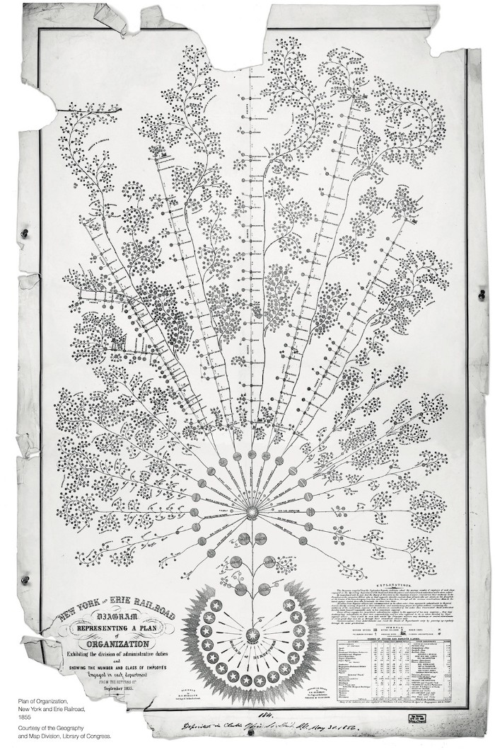
The inception of the org chart dates back to the early 19th century when Daniel McCallum, an engineer and the General Manager for the Erie Railroad Company, produced this awe-inspiring display of data and design.
McCallum was way ahead of his time.
The level of complexity in his design is staggering compared to what we see today. Like modern org charts, it maps out teams, functions, and hierarchies. But it doesn’t stop there. It continues, mapping out the rail system itself and its relation to the work happening around it, while simultaneously visualizing networks of communication.
This was something no one else was thinking of at the time. Even today, many organizations overlook the importance of their internal networks of communication.
While intricate, McCallum’s org chart likely represented more of an ideal than it did reality. Measuring communication networks in the 19th century was virtually impossible. Researchers would've needed to hand-track every conversation that took place at work. Even if they could somehow manage that, structuring and analyzing that data would have taken an unreasonable amount of time and effort in lieu of modern day computing.
[The McCallum problem] Only when we can reliably measure the realities of communication can we begin making improvements toward the ideal.
Luckily, we live in the age of technology. The tools we need for accomplishing these tasks are readily available. And they can be used programmatically – a key ingredient to scale. Our techno-key to solving the McCallum problem is network analysis.
Mining Network Data in the Age of Technology
With every second that goes by, millions of emails zoom across the world wide web. Factor in messaging tools like Slack and Microsoft Teams and in a few days we suddenly have more communication data points than there are stars in the galaxy. Network analysis allows us to connect the dots between these points, revealing patterns and connections that were otherwise occult.
But the use of our data from such mediums makes most people uneasy. Although most network analyses are done programmatically [i.e., no one is reading your messages], our data has been so exploited over the past decade that data privacy has become a new kind of social anxiety. Paradoxically, it prevents us from using it for the right reasons.
The good news is these mediums don’t have to be our only source of data. Many organizational network analyses [ONAs] rely on survey data to conduct analysis. I would argue, that in many cases, a well-designed survey can provide a richer dataset than those communication channels ever could.
Think about it:
With email, we can extract [1] who the message is from and [2] who its receiver is. We may even be able to [3] determine sentiment using Natural Language Processing [NLP] models.
But with surveys, we can ask respondents [1] who they communicate with and [2] to rank those people in order of importance. We can also ask [3] who they need more communication from or [4] what the qualities are of the individuals they communicate with [i.e., whether they are viewed as experts, collaborators, mentors, etc.].
With surveys, we can extract data about networks that we couldn’t from email or messaging alone. When visualized, this data becomes extremely useful in navigating the complexities of dynamic organizations.
I believe this is where the future of the org chart and the next adaptation of McCallum’s work lies.
Where ONA Makes the Difference
The applications of ONA spans across many scenarios. In my opinion, it is much more than a tool for visualizing communication. It is a tool for understanding the flow of your organization's greatest asset: information.
Time for a few examples:
[Quick lesson on terminology] A node is a circle which typically represents a single person or entity who is communicating with another. edges are the lines between nodes that represent communication
Mapping Out Experts - PyCon 2016 by Johannes Wachs:
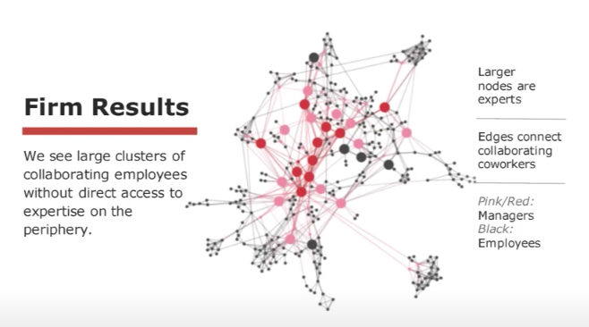
Reddish Nodes: Managers
Black Nodes: Employees
Large Nodes: Experts
We can quickly tell who the key players of the organization are here. We can also see that there are these clusters of employees who have limited access to experts. This alone is useful in understanding where the organization may be lacking in resources or talent.
If we looked at performance data, we may also find that those with less access to experts have lower performance on average. Without this analysis, the organization may mislabel these individuals as poor performers. But with it, we understand that these individuals may be lacking the guidance and resources they need to do their jobs well.
Visualizing Diversity & Inclusion - Deloitte:
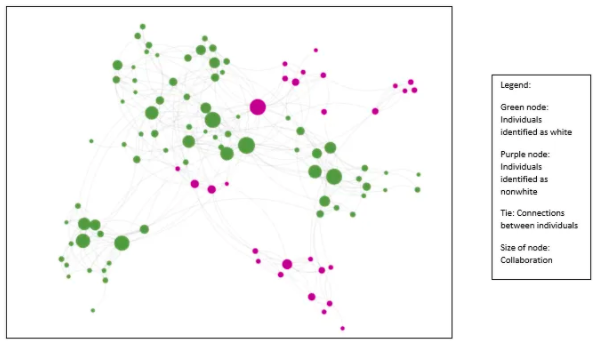
Green nodes: Individuals who identify as white
Purple nodes: Individuals who identify as non-white
Node Size: Level of collaboration
The first thing you'll notice here is the disproportionate number of large green nodes to large purple nodes.
If it isn’t clear already, diversity does not imply inclusion.
The graph shows a clear trend of white individuals who have more opportunities to collaborate than their nonwhite counterparts. Unfortunately, this can be fairly common when organizations focus efforts on diversity but neglect inclusion.
Simple ONA - Myself
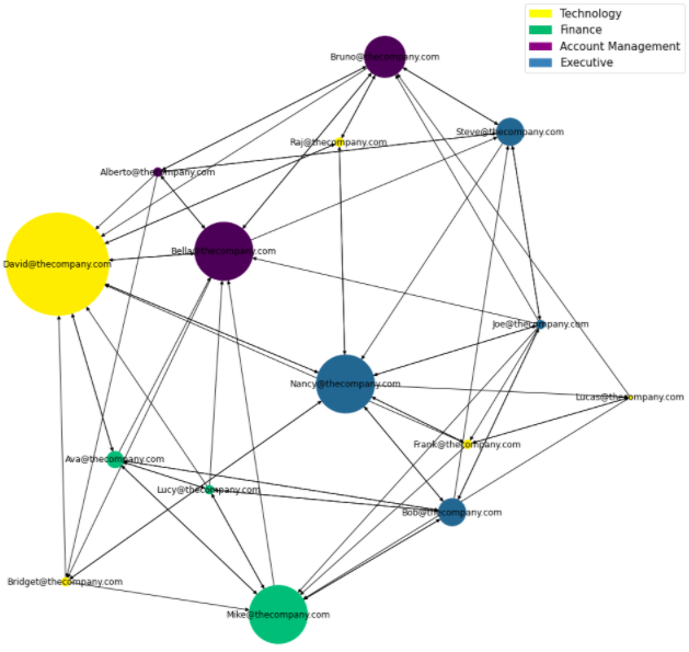
In this last example, I’ve used Python to conduct a simplified ONA [which you can find on my GitHub].
Nodes: Employees
Node Color: Department
Node Size: Frequency employee is sought out by others
The graph makes it clear that David [big yellow node] is the most sought out person at the company.
If you happen to check out the GitHub repo for this project, you might’ve noticed that David is an IT Support Specialist. Knowing this, we might deduce that there is a high volume of IT-related requests at the company, suggesting a possible lack of resources in the technology department.
A second notable observation is that Bella [medium purple node], a Jr. Account Executive at the company, is sought out fairly often. Posing the question: should a junior-level employee have that much responsibility?
The fun part about ONA in Python is that we can dig deeper into this question by applying a few transformations and calculations to our dataset:
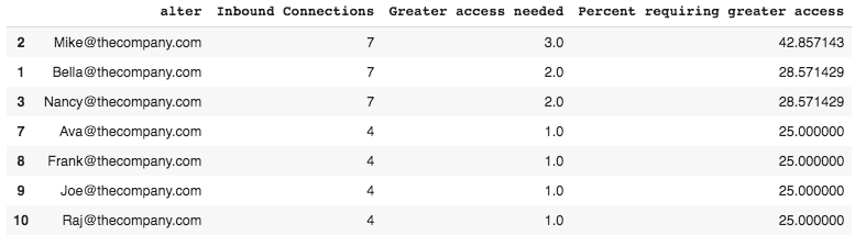
Here we are measuring collaborative overload, a concept that defines the limits in which the average worker can be sought out by others without experiencing burnout.
That number is about 25%. And as we can see for Bella, this number is about 28.5%, putting her at a much higher risk of turnover.
Making Sense of The Unseen
As you may have realized by now, ONAs can be remarkably insightful. What I’ve walked you through today merely scratches the surface of what they can do.
Their true power lies in making sense of the unseen.
Visualizing informal networks of communication is the first step in understanding the dynamics of complex organizations. While traditional structures continue to deteriorate as modern organizations evolve, informal networks will become more and more influential. Understanding the future of work means adapting to these changes and utilizing new tools and technologies to do so.
Just like a modern explorer wouldn’t plan an adventure using a renaissance era map, you shouldn’t design an organization using century-old tools.
Mapping out organizations is like a form of geopsychology: the underlying factors that contribute to structure also influence behavior. Acknowledging this is simply keeping up with the times.
Thanks for reading!
If you liked this post and are interested in conducting an ONA of your own, be sure to subscribe to be notified when I post part III of this series. There, I will walk you through the entire process. I even include the survey I use to collect data so you can really experiment.