
O-networks: a beginner's guide to ONA in python
In part III of the O-Network series, you'll learn the frameworks for conducting Organizational Network Analysis (ONA) in Python. If you haven't done so already, check out part II of this series where I discuss the value of ONA and why I think it's the future of the org chart.
If you're already familiar with ONA, you'll only need to know a little Python.
How This Works
In the Github repo for this project, you'll find a .ipynb file, which is an interactive Python notebook. I find interactive notebook tutorials one of the best ways to learn, so feel free to hop over there to do this in parallel.
The easiest thing to do is to open the .ipynb file in Github and hit the "Open in Colab" button. This will bring you to the Google Colab environment with the file already set up for you. You'll need to save a copy of the file in your drive before you can save changes. Make sure to download the excel workbook from the repo as well.
For the sake of this walkthrough, we'll be using dummy data. If you want to use real data, you'll need to distribute a survey using the questions in the Questionaire_Items tab of the Simple_ONA_Survey.xlsx workbook and fill in the responses in the same format as in the Response_Data tab.
Let's Begin
We'll start by importing the necessary packages and uploading our data.
#importing Packages
import pandas as pd
import numpy as np
import networkx as nx
import matplotlib.pyplot as plt

#loading dataset into colab

from google.colab import files

uploaded = files.upload()
Note: When using Google Colab, we need to upload our data into the environment before loading it into a dataframe. If you are not using Colab, you can skip this step by entering the path where you saved the data file locally in
pd.read_excel()below.
DataFrames
For each sheet in the workbook, we need to create a DataFrame.
#survey data
survey = pd.read_excel('Simple_ONA_Survey.xlsx', sheet_name='Response_Data')

#questionnaire items
questions = pd.read_excel('Simple_ONA_Survey.xlsx', sheet_name='Questionnaire_Items')

#hris data
hris = pd.read_excel('Simple_ONA_Survey.xlsx', sheet_name='HRIS_Data')
At this point you should also check that the data is loading properly using .head(). Here is what running survey.head() should look like:
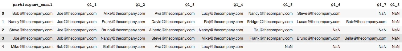
You'll notice that I cut off the right half of the dataframe because of its size. We will address this later.
Manipulating The Data
We can break this section down into parts:
Transposing
Transposing means turning rows into columns (or vice-versa). Our survey data is currently row-wise (having input variabls across rows). To do our analysis, we will need to convert this to column-wise so our inputs variables are in a single column.
network_data=pd.wide_to_long(survey, stubnames=['Q1_','Q2_'],
                                      i='participant_email',
                                      j='alter_id')
What this code is doing is looking at the survey data, putting the responses from Q1_ and Q2_ into individual columns, and pivoting on participant email. alter_id is a new variable that gets created in the process.
Dropping Nulls
Some of our participants didn't have as many as 14 people listed as important to their work. We can drop these records from the dataframe.
network_data=network_data[~pd.isna(network_data['Q1_'])]
network_data.reset_index(inplace=True)
Now let's run network_data.head() to look at our reshaped dataframe.
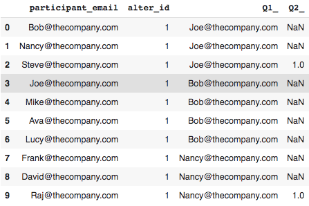
Our new dataframe has emails in a single Q1_ column and a 1.0 in the Q2_ column if a participant listed the person in Q1_ as needing greater access to them.
Ego and Alter
Now we are going to create what is called an ego network. The ego is a single entity or node associated with an alter; the entity or node connected to the ego.
We should rename participant email and Q1 to make this more clear. We can also rename Q2 to reflect the associated question [for readability].
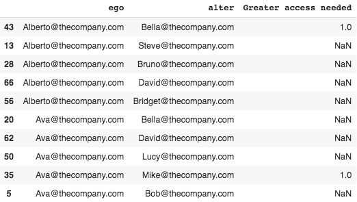
network_data.rename(columns={'participant_email':'ego',
                                      'Q1_':'alter',
                                      'Q2_':'Greater access needed'},
                             inplace=True)

#we don't need this column anymore
network_data.drop(columns='alter_id', inplace=True)

#sorting participants for readability
network_data.sort_values(by='ego',inplace=True)

#let's see what this looks like
network_data.head()
Joining DataFrames
We are ready to join our newly transformed network_data to the hris data.
#first we need to copy the hris data
ego_hris=hris.copy()

#next we will rename columns to match the network data
ego_hris.rename(columns={'email':'ego',
                                 'Title':'ego_title',
                                 'Department':'ego_team'},
                                  inplace=True)

#now we can join the ego hris df to the network data
network_data=pd.merge(network_data,
                               ego_hris,
                               on='ego',
                               how='left')

#we will repeat this process for the alter
alter_hris=hris.copy()
alter_hris.rename(columns={'email':'alter',
                                   'Title':'alter_title',
                                   'Department':'alter_team'},
                                    inplace=True)

network_data=pd.merge(network_data,
                               alter_hris,
                               on='alter',
                               how='left')
And that's our transformation!
Pretty simple right?
If your not confident, you can always run network_data.head() again. Otherwise, its time for our analysis.
Analyzing Our Network
Cross-team Collaboration
A common way to analyze networks is to use cross tabulation. The .crosstab() function allows us to quantitatively analyze relationships between multiple variables. We can use this measure team collaboration.
#the crosstab function creates a frequency table
cross_team=pd.crosstab(index=network_data['ego_team'],
                               columns=network_data['alter_team'],
                               normalize='index')
#multiply by 100 to get percentages
cross_team*100
Sometimes called a contingency table or block density chart, the table below shows the number of connections to other groups as a percentage of the group's all outgoing connections.
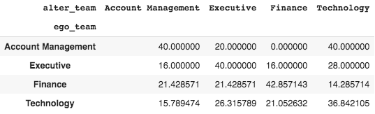
These results suggest that most teams collaborate internally [highest percentages are within groups], which is expected. However, in an organization where collaboration is essential to success, we might want to make adjustments after seeing these results.
Visualizing the Network
Now it's time to visualize our network. To create our network graph, we will utilize the networkx package. The first step is to tell networkx what data to use.
Our first parameter is our network_data, the source is the original connection node [ego] and the target is what the source is connecting to [alter]. The create_using parameter tells networkx which type of graph we want to use. For this case, we want to use a DiGraph(), which allows connections to go both ways [people can both seek and be sought].
network_graph=nx.from_pandas_edgelist(network_data,
                                      source='ego',
                                      target='alter',
                                      create_using=nx.DiGraph())
Now that we have told networx which data and graph type to use, we can use matplotlib to make some adjustments, followed by nx.draw_networkx() to draw our graph.
plt.figure(figsize=(20,20))      #change the default plot size
limits=plt.axis('off')           #get rid of the axis

nx.draw_networkx(network_graph,  #draw the graph
                 arrows=True,
                 node_color='b')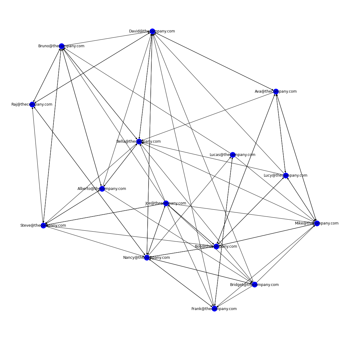
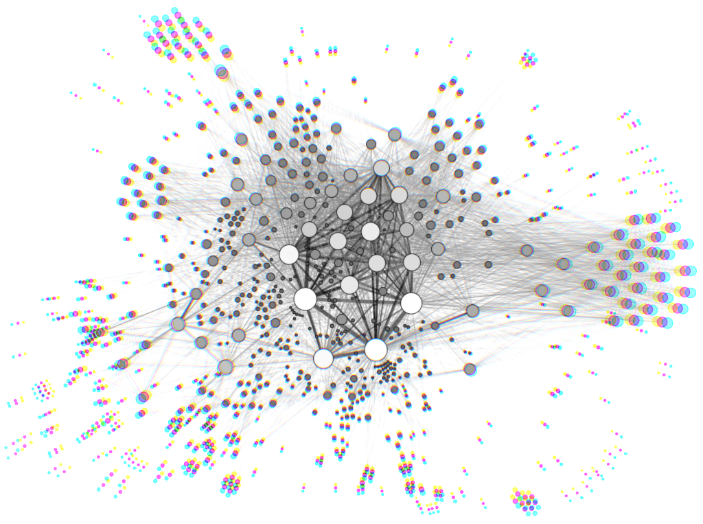
Awesome! We've created our first network graph. This shows us who is connected to who, but for right now, that is all it shows.
Let's see if we can make it a bit more insightful.
We can start by sizing each node according to how often that individual is sought out by others. This is referred to as degree centrality.
Specifically, we will look at in-degree centrality, which refers to the number of incoming connections.
We'll start this process by creating a dictionary that will be used to size the nodes using our network_graph and the in_degree() method. If you are curious about what this is doing, you can run the first line by itself followed by print(d).
d = dict(network_graph.in_degree())

#re-draw the graph
plt.figure(figsize=(20,20))
nx.draw_networkx(network_graph,
                 arrows=True,
                 node_color='b',
                 node_size= [v**4.1  for v in d.values()])
The formula inside node_size is called a list comprehension. It is saying that for every value v in our dictionary d, raise that value by the power of 4.1.
Note: 4.1 is an arbitrary number that can be adjusted to customize your graph's output.
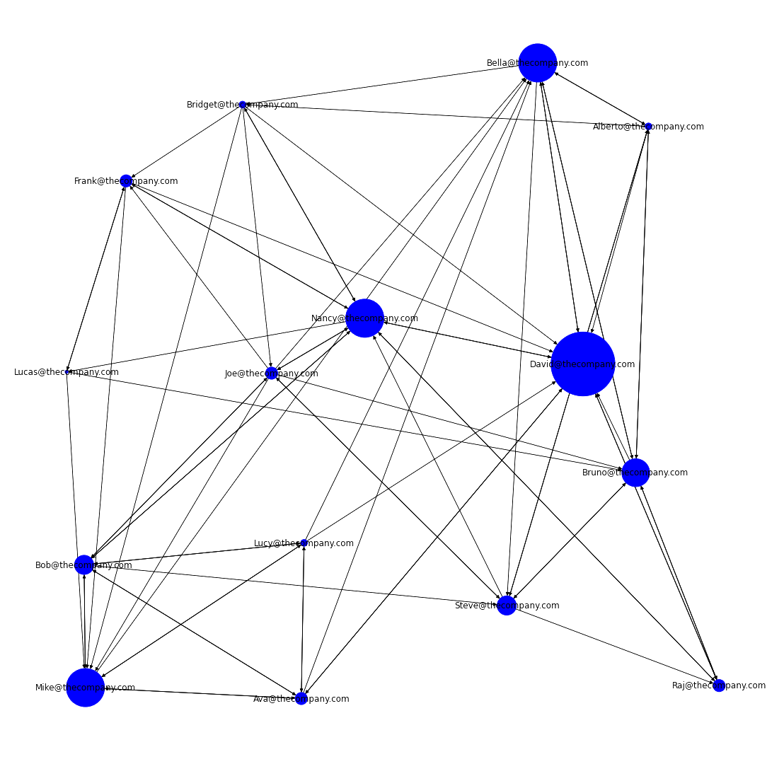
Nice! Our graph is now showing us who receives more or less connections based off the size of each node. We can take this one step further by adding in department data.
First, we will need to make a 'color key' for networkx to work with.
The below code assigns a numeric value for each department which will then be used to assign color to each node.
hris = hris.set_index('email')
hris = hris.reindex(network_graph.nodes())
hris['Department'] = pd.Categorical(hris['Department'])

#run this line to see what it looks like
hris['Department'].cat.codes
These next few lines should look familiar, except in the node_color parameter, we want to apply our cat.codes method to the hris['Department'] column.
Then we will import Patch and Line2D to create a legend for the the departments
plt.figure(figsize=(20,20))
nx.draw_networkx(network_graph,
                 arrows=True,
                 node_color=hris['Department'].cat.codes,
                 node_size= [v**4.1 for v in d.values()])

#import Patch & Line2D
from matplotlib.patches import Patch
from matplotlib.lines import Line2D

#create legend
legend_elements = [Patch(facecolor='yellow', edgecolor='yellow',label='Technology'),
                   Patch(facecolor='mediumseagreen', edgecolor='mediumseagreen',label='Finance'),
                   Patch(facecolor='purple', edgecolor='purple',label='Account Management'),
                   Patch(facecolor='steelblue', edgecolor='steelblue',label='Executive')]

plt.legend(handles=legend_elements,prop={'size': 15})
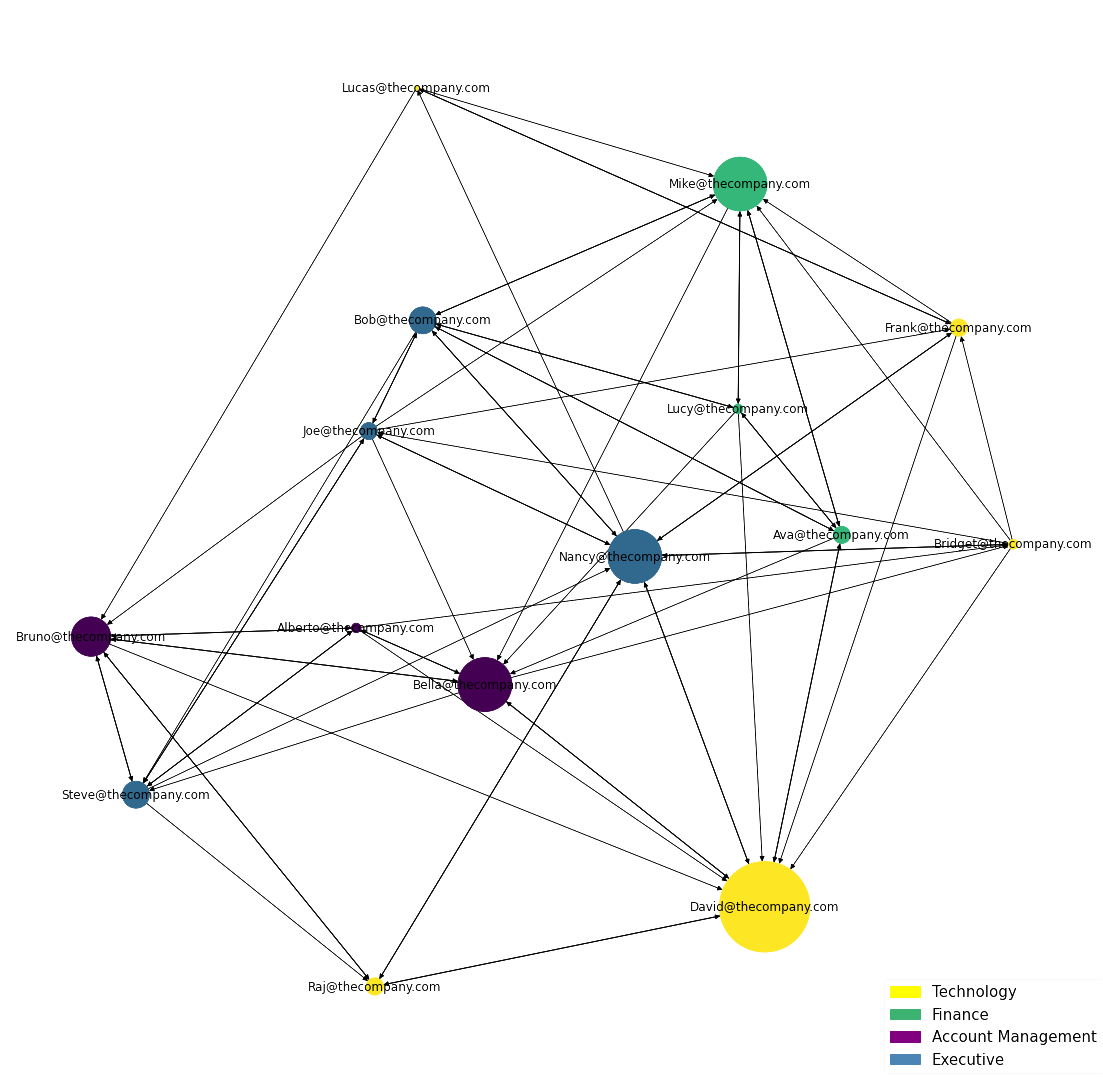
Now thats a graph!
It's clear David is the most sought out person at the company. If you ran hris.head() before, you would've seen that David is an IT Specialist. This could suggest that David is lacking resources and is potentially overwhelmed with his work.
Let's see what else we can learn.
Further Analysis
We can dig a bit deeper into our analysis by applying a few more transformations and calculations to our data set. This part isn't required, but I think it can be just as insightful as our network graph, if not more.
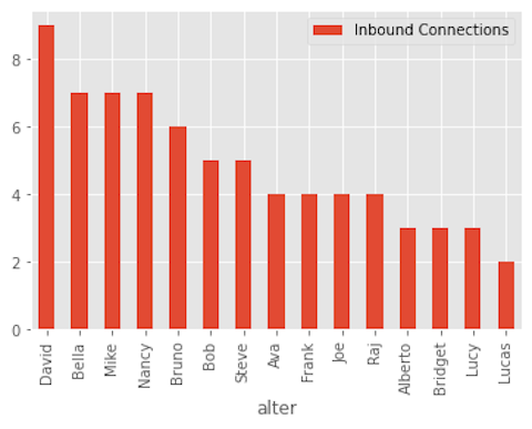
Let's start by displaying the number of inbound_connections.
We can use pandas to count the number of times someone is named as important for anothers work. The .groupby() function will combine rows with the same email (i.e., participants) and .size() will count them.
inbound_connections=pd.DataFrame(network_data.groupby('alter').size())

inbound_connections.reset_index(inplace=True)

#we want to rename the count to something more intuitive
inbound_connections.columns=['alter','Inbound Connections']

#we can sort to see who is most influential on top
inbound_connections.sort_values('Inbound Connections', ascending=False,inplace=True)

#we can plot to visualize
in_c_graph = inbound_connections
in_c_graph['alter'] = in_c_graph['alter'].str.replace('@thecompany.com', '')
in_c_graph.plot(x='alter', kind='bar')
Collaborative Overload
Collaborative overload is a measure we can use to assess burnout and turnover risk. It compares how frequently a person is sought out to how often someone else says they need more access to them. In my opinion, this is one of the most useful metrics of ONA.
Research by Rob Cross and Adam Grant at Connected Commons shows that when 25% or more of the colleagues seeking a particular person say they want greater access to them, that particular person may be suffering from collaborative overload.
Let's see who is overloaded.
First, we should count the number of times someone said they needed greater access to someone else. For this we can use .groupby() with .sum(), since our 'Greater access needed' variable is binary.
overload_count=pd.DataFrame(network_data.groupby('alter')['Greater access needed'].sum())

overload_count.reset_index(inplace=True)
Now for each person in the network, we'll calculate the percent of people saying that they require greater access to that person. To do this, we will first need to use .merge() to combine our inbound_connections with the overload_count. We will rightfully name this dataframe collaborative_overload. Then we will apply a calculation to get percentages.
collaborative_overload=pd.merge(inbound_connections,overload_count,on='alter')


collaborative_overload['Percent requiring greater access']=100*collaborative_overload['Greater access needed']/collaborative_overload['Inbound Connections']

#sort for readability
collaborative_overload.sort_values('Percent requiring greater access', ascending=False)
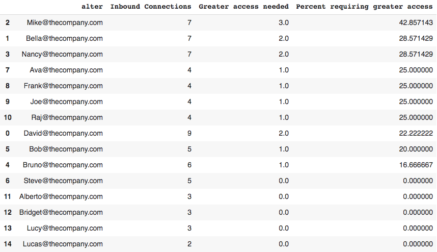
Greater than 25% = high risk of turnover.
It's easy to tell from here who might be at risk.
From these insights, we can make adjustments. Maybe we need to offer coaching to the employees at risk. Maybe we need to redesign jobs. Maybe we need to completely restructure. Without conducting an ONA, we may have never known this about our people.
Final Thoughts
Simplicity and power are two attributes that don't always come together in programming. By now, I hope it's clear that this is not the case with ONA. Though adding complexity is relatively easy, keeping it simple can prove surprisingly insightful. And as cool as ONAs can look, it is the insights that make them a truly powerful tool.
While the visual aspect is never static [which is important to remember], having a better understanding of the flow of information paints a much more realistic picture of the organization.
I believe, network graphs will be the future of org charts — live and in 3-D.
Thanks for reading!
I encourage all readers to check out the GitHub repo for this project. Everything you need to do this on your own is there. You don't even necesserily need to know any Python. If you can follow instructions and run a cell in an interactive notebook [pressing Shift-Enter will do the trick], you can do it too.
For anyone that does decide to experiment with this, I'd love to hear how it went.
Special shout out to Ben Zweig, CEO of Revelio Labs who first introduced me to ONA through a meetup @ NYU!
Join like-minded individuals interested in learning how they can synthesize aspects of psychology and engineering to work smarter and promote excellence: subscribe!